The Wire Chair

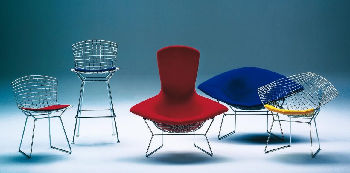
The birth of the wire chair’s popularity can easily be traced back to Charles and Ray Eames’s wire side chair released in 1951. This iconic object for everyday use fit right along with their fundamental principle for its use of new material. Wire rods were by no means new material in that era although their use as a structure for seating certainly was. As is the case when it comes to iconic forerunners, this simple side chair was not the only one of its kind. Beyond this side chair by the dynamic Eames duo, Harry Bertoia’s 420 side chair is just about the only iconic wire chair recognizable by name to the modern enthusiast.

A designer, engineer or architect has much to think about when concocting a chair from this rigid, yet flexible material. The chair needs to hold up to the weight of the average human body, needs to to be functional as a chair (subsequently, a chair’s many uses), all the while maintaining its shape – must we add it should be comfortable? Designer’s like Russel Woodard, Verner Panton and Harry Bertoia have produced real-life visions that embody all of these aspects and often is the case a cushion is needed to address the matter of comfort.

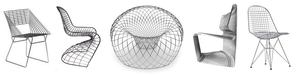
The contemporary wire chair of today knows only the limit of a designers computer software and the available funds to produce the project. Take Verner Panton’s iconic plastic cantilever chair – a first in its field for being molded from a single mold of plastic, virtually indestructible for daily use and naturally produced in its bold colors. Now, from a CAD computer program’s wireframe rendering those curvaceous lines and shapes of this plastic chair can be produced through the process of meticulously bending each rod of chrome-laden wire to intersect just right – mirroring the chair itself. It is any wonder how the Bertoia and Eames chairs of their day were executed without the aid of a computer. Contemporary masterminds such as Brodie Neill blew the minds of furniture and design lovers in 2011 with the release of his Reverb chair. This spherical vortex of wire mesh reminds one of  a theoretical wormhole – have a seat in the center and take a load off!

For collectors

Reproduction of a Harry Bertoia Side Chair – click to view detail

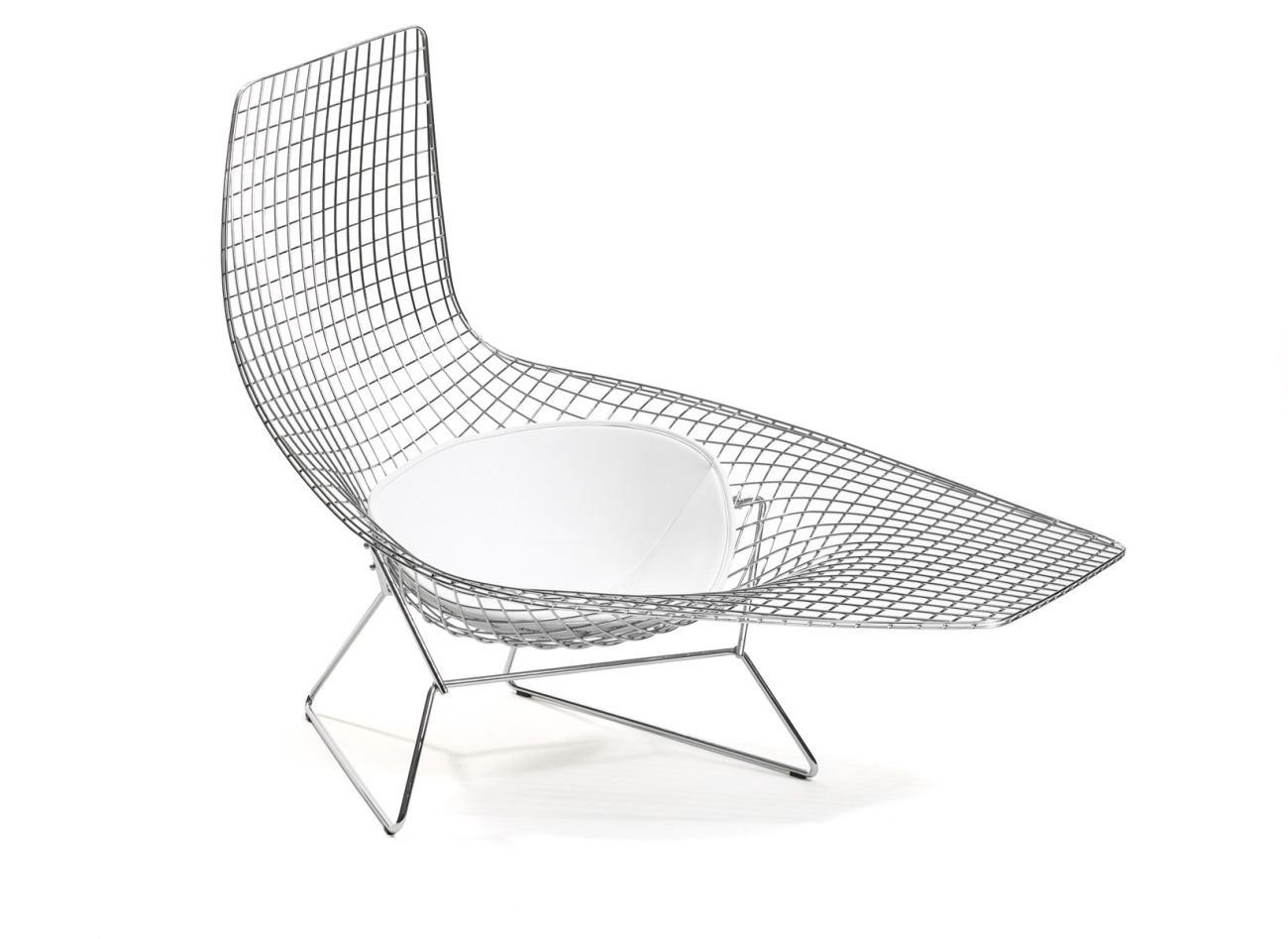
Wire chairs are hard to make. Production costs can easily outweigh the benefits of selling at an affordable price. Therefore it is usual that the best of the best (and easiest to produce) designs are sent to the open market. Chairs by Warren Planter, Verner Panton and most contemporary designs are a safe bet as far as authenticity are concerned. Chairs by Charles and Ray Eames and by Harry Bertoia don’t have that luxury. To some imitation is the best form of flattery, so it is left to the consumer to decide whether or not to buy authentic or to buy a reproduction. For the most popular Harry Bertoia side and diamond chairs, take a look at their main outermost structural elements. You’ll notice that on the originals there is one wire holding together the structure with the mesh of structural wired welded to this one. Now, take a look at an inexpensive knock-off. The eye instantly sees the two wires holding the structure together around the entire chair and back of the seat. These pieces of lesser quality are designed in this fashion to allow a manufacturer to use a thin gauge of wire – not as Harry Bertoia had originally planned.

The Pantanova and Planter chairs – as with the more complex designs – are usually out of reach for the beginning consumer. A Pantanova Chaise can run between 4000-7500USD with the wormhole-like Reverb chair (created in a very limited production) costing 25,000USD. Our best bets are to find the chair (or chairs) you love and research! Then, stalk! Original Bertoia and Eames wire side chairs can be found at your local mid-century dealer in the 175-400USD range. As always, check the web and eBay. If you miss out on a bargain, never fear, there will always be another chance as millions were produced for the global market. On the higher end if you find what suits you best, never be afraid to ask a dealer if they can come down on the price. Even the most high end of dealers will consider a slight discount if they know they will receive a certain sale. Whatever your choice you’ll find that a wire chair will bring a unique linear openness to your space – making these useful structural objects a great addition.

Theresa Poulton – Painting and Sculpture

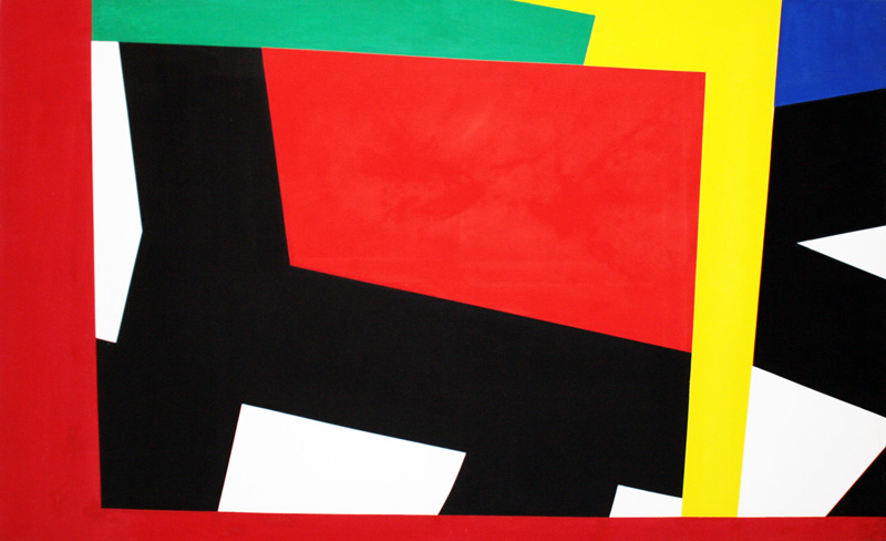
Theresa Poulton is a hard-edged, abstract geometric painter who makes works which fluctuate between the historical tradition of canvas painting and ‘painting in the expanded field’.

Theresa’s boldly coloured canvases, painted objects and installations give a nod to Kazimir Malevich, El Lissitzky, Sophie Taeuber-Arp and Henri Matisse.

Contemporary influences include Biatriz Milhazes, Katharina Grosse, the designer Emilio Pucci and architect Frank Lloyd Wright.

The importance of colour is evident within Theresa’s paintings. The science of colour, including the research of colour theorists Johannes Itten and Josef Albers is acknowledged however her work is not rigid it is intuitive, she responds as the work evolves.

I am not trying to represent any sort of reality, the colours are not meant to represent anything, the colours are fantastical and the painting is a fantastical journey.

Big Orange is a large scale, open formed, work of differing abstract layers. Collectively creating a sense of depth and illusion, brightly coloured hard-edged abstract geometric forms float on the surface of a contrasting vibrant  expressionistic colour field.

Coloured pencil lines cut across and connect the geometric and the expressionistic elements.

Originally shown as part of a site specific painting installation, the work expanded from the canvas onto the gallery wall in response to her other works, the light, shade and architecture of the space.

Theresa creates illusory environments of contrasting colour, distorting perspective with line, shape and form, exaggerating the implied sense of depth and space.

Big Orange Installation re sized

Big Orange – Installation View

Big Orange is a resolution of past and present forms of abstraction within my practice an intuitive balanced work where the expressionist elements are off set against the hard edged abstraction of the opaquely painted geometric forms.

Paint applied flatly in opaque colours from her custom palette contrast in appearance and form with experimental colour often mixed directly onto the painted surface.

There is a preliminary with these works, there was a drawing, then I distorted it and altered the colour digitally, imagining how it would work on the canvas. The distortion of the image is me looking at it and seeing how I can resolve it, no, there is a moment when I know it’s right, the search for that moment is the excitement for me.

The painting process is laborious, quite controlled, I like that, but it’s a puzzle to me also. The work, while I am making, seems quite chaotic, in my mind I feel very uncontrolled, it feels like the ‘idea of the painting’ is out of control…

Theresa makes no apologies for making controlled, precise works, she refutes the fact that they are about perfection,

..they hang on a wall, they become part of the wall and they occupy the space in which they stand.

Geometric abstraction can appear deceptively simple, Theresa has many tools in her armoury to engage those who look a little beyond first glance.

I tease the perception with non-existent forms, depth created through contrast of colour, suggestive perspective and illusory canvas edges.

As her process has developed the works are becoming sometimes, busier, constantly appraising her methods and materials means the works are always fresh though the Theresa thread is evident. Working with changing media brings differing challenges and experimentation.

The decision to stop painting is so ambivalent; I am often in danger of overworking it because I am so lost in it at times. Not knowing exactly how it’s going to come out is a big part of it for me.

Some of Theresa’s latest works are objects and assembled multi-media miniatures, allowing the works to be viewed from all sides, a development of her edge painted canvasses and a desire to make the illusory depths real.

Theresa also creates painting installations, carrying into them recognizable assets of her canvas paintings, these works she describes as immersive environments, distorting the perspective of the space which they occupy instead of the illusory environments within her canvas works.

In the same way that I compose my paintings, I construct the mixed media assemblages and site specific installations, space, line, shape, colour and form are all considered.

Visit her website and view more work.

Klasema Collection of Modern Art

The Klasema ART abstract Modern Art collection covers a unique selection of prominent early European, North America and Russian Modernist artists, painters and sculptors. Driven by passion for beauty and quality, these (geometric) abstract Modern artworks have been carefully collected over the past forty years, with a special focus on abstract Modern artworks from the influential post-war period (1945–1976).

klasema Art Collection - the netherlands

Klasema Art Collection – The Netherlands

Stumbling upon the Klasema Art Collection is like stumbling upon a treasure trove – an encyclopedia of modernist art. All abstract and predominately geometric in nature, the collection as a whole is fascinating and inspiring in its vision. Yet, surprisingly, Klasema ART remains accessible and educational in its overall approach.

I found Klasema in my young and eager searches for inspiration and in my hunt for adding to my own collection of geometric abstraction. Searches for Joost Baljeu, Jean Gorin and Silvano Bozzolini kept leading to the same place.

At first apprehensive to make first contact and inquire I found the site an exceptional source of knowledge. I am happy that I did. You see, I am in the United States – Klasema, the Netherlands. Although fond of early American geometric abstraction my tastes and curiosities have grown to European works which inspired (and were inspired by) the same vein of mostly non-representational art. Our esthetic tastes are very well aligned with painting and sculpture dominating the collection.

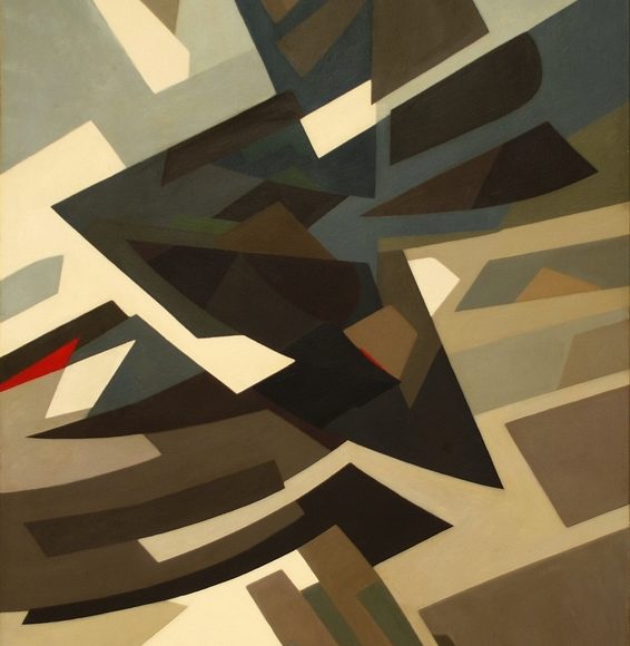
Helen Gerardia, 1951

Helen Gerardia, 1951

I would have never realized that the people I’d make contact with at Klasema were so very open and approachable – not to mention as passionate. Almost like a close friends I’ve known for years whom I just so happen to have never met. Not yet anyway. Equally open to a question from a young artist or from a seasoned collector interested in their next acquisition.

Original founder Henk Klasema had little by way of serious connection to art in his youth, but always, an appreciation stood very close by. As he matured and became successful in his business endeavors his appreciation exploded into a life-ling passion. Much like a collapsing celestial being his passion’s gravity soon caught hold of his immeadeate family.

Unexpectedly, Henk Klasema passed away in 2011, now the collection and its private museum-like grounds are continued by his wife Anneke Klasema van Loenhout, who stood at his side for forty years and is as passionate an knowledgeable about Abstract Modernism and the artists in the KLasema ART collection.

As is usually the case with any serious art collector the family made friends with the artists, acquiring bodies of work that often span their careers. This collection often exhibits the nuances and changes within several of their artists works over a span of time. As the collection grew the family started acting as both collector and dealer of these works by placing important works into other collections and publishing multiple books and catalogs.

Follow and learn more from Klasema on Facebook.

Visit the Klasema ART – Collection of Modern Art  online. I like that each piece is accompanied by a description and information about the artist/creator.

A few questions

…with the collection’s director Anneke Klasema

CI: All of the work represented is abstract and geometric in nature. Some is very tight and what one thinks of as hard-edge geometric abstraction (Jean Gorin for example) – and some work is very loose, bordering on abstract expressionist (Hendrik van Bottenburg and Willy Boers). Can you give us some insight into how the collection has evolved to include this mix of esthetic over time?

(AK): As do most Artists, we started out with an interest in high quality figurative art. Names like Gino Severini, Isaac Israels, Reimond Kimpe, Hendrik Willem Mesdag and Max Peiffer Watenphul were part of our early collection . We however changed gradually into acquiring more and more early Modern abstract artworks. As my husband once put it ‘Abstract art is very personal and touching. For me, the feeling of equilibrium and beauty is important. Exaggeration of colour and composition must be avoided. In my opinion an artist should always focus on the heart of the matter and should try to keep things as simple as possible’.

CI: If you and your family were to choose one or two works in your current collection that could be considered a quintessential work which piece would it be? What about this work makes it such a great representation of the collection?

(AK): This is always a difficult question. This is a very personal thing. Different people have different tastes. But for me the works that have very special meaning and can be considered quintessential to our collection are the Joseph Lacasse (1952), Nicolas Warb (1945), Dolf Breetvelt (1950) and the Walter Helbig (1932). These works are all absolute masterpieces by the artists. The use of colour and composition, the quality and uniqueness. Over the years my husband Henk and I have always focused on collecting top quality art, and these works are just that.

Neo-Plasticism & De Stijl

Neo-Plasticism, De Stijl and its contemporary influences.

Piet Mondrian

Twentieth century art is seen by many as a series of movements evolving from either an opposition to or an extension of concepts of previous movements. While some movements quickly pass the newness stage in their lifespans, their philosophies continue to live on, even though greater attention may be given to even newer movements. In the case of De Stijl and Neo-Plasticism, the theoretical end of this “life span” came with the death of one of its founders, Theo Van Doesburg. Here we explore the fascinating art movement and its influences on contemporary culture.

De Stijl, Dutch for “The Style”, also known as Neo-plasticism, was a Dutch artistic movement founded in 1917 and staked its place in the history of art and design at nearly the same time as its close counterparts Suprematism and Constructivism.  The group’s principal members were the painters Theo Van Doesburg and Piet Mondrian with a number of others artists like Bart van der Leck and the architects Gerrit Rietveld and J.J.P. Oud contributing shortly after the movement’s birth. The artistic philosophy that formed a basis for the group’s work is known as Neo-plasticism — the new plastic art.

Proponents of De Stijl sought to express a new utopian ideal of spiritual harmony and order. They advocated pure abstraction and universality by a reduction to the essentials of form and colour; they simplified visual compositions to the vertical and horizontal directions, and used only primary colors along with black and white. De Stijl was built on the fundamental principle of the geometry of the straight line, the square, and the rectangle, combined with a strong asymmetricality; the predominant use of pure primary colors with black and white; and the relationship between positive and negative elements in an arrangement of non-objective forms and disections.

These strict guidelines lead to works heavily weighted on their compositional structure – works whose subjects were produced as “pure” and non-representational abstraction and are not to be mistaken with the later Abstract Expressionist movement. These guidelines were very limiting yet have lead to an artistic language that has stood strong and influenced many throughout the ages as in fashion and typography design, product design as reinterpreted through the Bauhaus school, architecture and visual art later in the 20th century. Artists working in the template of Neo-Plasticism and De Stijl had just begun to experience success in the early 1940s when the emergence of Abstract Expressionism swept aside the public recognition of those achievements. It was not until Minimalism ushered in a renewed enthusiasm for geometric abstraction in the 1960s that their works began to receive serious attention.

Architecture

The Schroder House designed by Gerrit Rietveld in the Netherlands is one of the very few examples of Neo-plastic architecture. Although there are many examples of murals, ceramic and interior installations designed to reflect the principles of Neo-plasticism there are very few architectural structures. The Schroder House is the only shining example remain to this day.

Rietveld’s Shroder House

 Neo-Plasticism in America

Burgoyne Diller

Burgoyne Diller

De Stijl and Neo-Plasticism were late arrivals to the American art scene in terms of its development as an art movement. Only through a few select gallery and museum exhibitions were American artists introduced to the works of European artists including that of Piet Mondrian and Theo Van Doesburg. The few drawn to the new plastic way of seeing had already established roots in Impressionist and Post-Impressionist painting.

Burgoyne Diller was the first noteworthy American painter to embrace the tenets of Neo-Plasticism. Diller was already on his way to making an important contribution to the development of non-objective art in the United States and his works were the footers in the foundation that lead to the development of the Minimalism movement of the mid 20th century.

Born in New York in 1906, yet raised in Michigan, he began painting and drawing as a teenager. Periodic trips to the Art Institute of Chicago proved monumental in his development – he found himself drawn to the Impressionist paintings and their use of color and composition to create volume on a two dimensional surface. Moving to New York City in 1929 and enrolling in the Arts Students League exposed him to progressive working artist’s work and the growing popularity of Cubism, German Expressionism and other Avant-garde styles. His first solo exhibition was in 1933 at the Contemporary Arts Gallery in Manhattan where he experienced a frustration with the fact that he could not sell any of his paintings. 1935 brought forth the opportunity to act as director for the Mural Division of the WPA Federal Arts Project where Diller was not only at liberty to create and execute public art projects but to commission other abstract artists to do the same. Diller was also a member of American Abstract Artist which promoted alternating sects of non-representational art through exhibitions and collaborations with museums and galleries. He continued to paint through the 40s and 50s defining his own personal graphic voice while serving as the acting director of the War Service Art Section and in the design department at Brooklyn College.

As is true with many artists, Diller’s work did not receive great recognition until after his death in 1965. His work is now considered a fundamental addition to the development of Abstract art and has been the subject of a number of important museum exhibitions throughout Europe and the United States. For the contemporary collector; Diller works are hard to get one’s hands on with works on paper (usually ink and/or gouache) ranging from 5000USD – 40000USD. Original paintings and wall constructions at 40000USD and up. Diller created no limited edition prints, limiting the entry level purchase to a work on paper – usually only available at auction Houses and fine art galleries.

Ilya Bolotowsky

Ilya Bolotowsky

Highly influenced by Piet Mondrian, Ilya Bolotowsky constantly searched for order through his visual expressions. However, unlike the earlier adapters of the tenets of Neo-plasticism Bolotowsky’s visual language was fueled by the now popular Suprematist, Cubist, Constructivist, and Abstract Expressionist art movements. Born in St. Petersburg, Russia, he immigrated to America in 1932 and attended the National Academy of Design. He quickly associated himself with “The Ten Whitney Dissenters”, a group of artists who, unhappy with academy and museum structures soon began to mount their own exhibitions. It was here that he credits his magnetic draw to Mondrian’s work.

Bolotowsky was also a founding member of American Abstract Artist where he met other artists such as Burgoyne Diller. It was Diller who gave him the commission for the mural for the Williamsburg Housing Project which was one of the first purely abstract murals created under the Federal Art Project. Bolotowsky’s career was temporarily put into suspension while he served his country, stationed in Alaska. From 1946-48 he was a teacher at Black Mountain College where he was not only influenced by his fellow teachers, but also by his students.

One may suspect by looking closely at Bolotowsky’s late work that clear, precise control of his images was of utmost importance. He did however emphasized the role of intuition over formula in determining his compositions and in many of his interviews states that the pieces are just as much an abstract composition as they are what the viewer saw in them. After all, one man’s Neo-plastic composition in yellow and blue was another man’s reduced aerial depiction of a farmer’s pasture dissected by roads and property lines!

Later in his career (the 1960’s – 1981), he began combining his two-dimensional works with three-dimensional forms, usually vertical and straight-sided columns.

Ilya Bolotowsky’s works are in multiple important public and private collections worldwide. Thankfully, since he was steadily producing work through the mid 20th century, he created many varied serigraphs and prints which are relatively easy to find from galleries, resellers, auction houses and online.

Pierre Clerk

Pierre Clerk

Pierre Clerk

Pierre Clerk was born in Atlanta, Georgia in 1928. He studied fine arts at McGill University, Loyola College and at the Montreal Museum of Fine Arts in Montreal, Canada. He traveled to Europe to seek further instruction at the Academy Julien in Paris, France and the Accademia di Belle Arti in Florence Italy.

Pierre Clerk first gained recognition in the United States and Canada with his large sculpture and painting installations – the most recognizable of these is still installed outside the Toledo Art Museum in Toledo, Ohio. Clerk was often quoted as having been strongly influenced by De Stijl. Well into the 21st century (in his 80’s) he continues to produce an astounding array of large-scale abstract geometric paintings from his studio in France. One can see an obvious tie to the fundamental rules of Neo-plasticism and De Stijl in Clerk’s work – however they beg to call these rules into question. Subsequently, he not only calls them into question, but disregards these rules just enough to define his work as a unique addition. Absent from his work are compositions adhering to strict primary color usage. Although black lines and shapes are often present in his work, rarely are they horizontal or vertical. Big, bold and commanding – his work is a perfect combination of art movements such as De Stijl and Minimalism as they presented themselves and evolved in his lifetime.

The Clerk image shown is from his Africa Suite. As with Bolotowsky, Clerk often produces work that is not just pure abstraction. Although abstract in nature the work often represents a theme, a place, an idea that is only known to Clerk and only slightly alluded to in a brief title.

Lucky for collectors, Pierre Clerk is still producing work (and large powerful work at that) to this day. For the beginning collector there are an array of serigraphs of excellent quality available at auction houses, galleries and online. Be sure to check out these recent paintings, on exhibit through his gallery representation at Cortex Athletico in France.

Bryce Hudson

Bryce Hudson

Bryce Hudson

Bryce Hudson is among a small set of contemporary artists presently working to decipher the boundaries of geometric abstraction as they relate to past art movements and the present day. Hudson, who is biracial, began his career with the production of symbolic works in which he would combine this geometric abstraction with an underlining tie to race and class stereotypes in American society. His black and white color frequently represented Black and Caucasian races, yellow and orange represented Asian and Latin races.

Hudson’s work has always been weighted on its compositional structure – he also produces multimedia prints and altered digital representations from the graphic advertisements and images of the 20th century. In his paintings the reductionist influences of De Stijl and the later Minimalism movement of the mid 20th century cannot go unnoticed.

Presently, Hudson has withdrawn from his original approach to these either tongue-in-cheek representations or direct reinterpretations from American census surveys and allowed his work to follow a more abstract nature.

Are they purely abstract geometric compositional works or are they interiors reduced to their most basic elements of shape, light and color? Whichever the case they, too, are part of the new plastic reality that his contemporaries set out to explore and define a century ago.

Bryce Hudson’s work can be seen on his site: Contemporary Artist Bryce Hudson

Cassandra C. Jones – Multi Media Artist

It is no wonder why we are instantly attracted to the work of Cassandra C. Jones. Her bodies of work are composed of borrowed and collected imagery that has been deconstructed and constructed in numerous compositions that allow the viewer an opportunity to experience the work on multiple levels. Jones presents the viewer with her own iconographic style where further inspection often leads to delightful surprises, but more so down a path of investigation into our on common cultural habits.

Cassandra currently lives between Brooklyn, NY and Ojai, CA.  On top of the dual home base situation she travels a great deal and over that last 7 years has fostered a practice where she considers her laptop and wherever she can find a WiFi signal to be her main studio.  Everything she produces starts there – searching for and collecting thousands of other peoples snapshot photos from stock photography agencies, eBay, public domain archives and every image exchange known to Google.  She then compiles these photographs in groups of like subject matter, from lightning bolts to every possible increment of a horses gallop.  She then organizes each lot in various ways (via video, print or installation) that tell stories about human observation and the power of photographic imagery in our snap-happy contemporary lifestyle.

“My photography archives and the works I create from them are documents of a banality that have emerged from an over-abundance of common imagery.  Led by a desire to create a counter to convention, I am attempting to liberate specific visual clichés by embracing them.  I draw connections between theses images to demonstrate that the most prevalent scenes we are compelled to capture, somehow link us.  Alone, these photos have diverse meanings but when linked together they reveal much larger stories of history, ritual, desire and innate human aesthetics, regardless of author.”

Flamingo Flowers

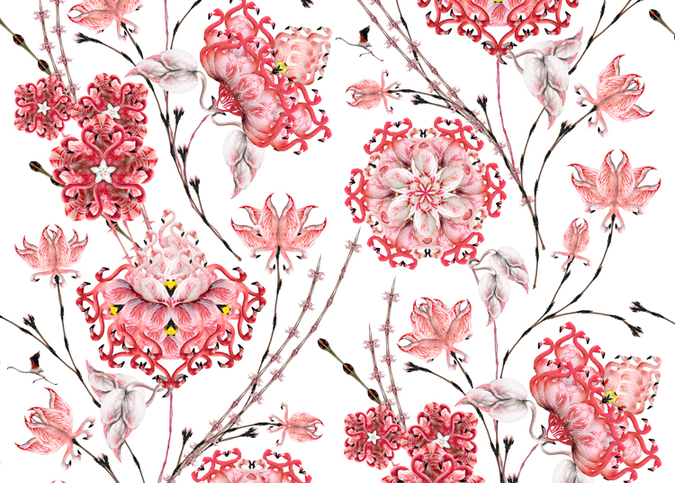
Rara Avis, meaning “strange bird” or “something rare”, is a series of projects made from Jones’s collection of bird photography.

This includes wallpaper and prints composed of photographs taken of real pink flamingos that are discernibly reminiscent of their retro plastic counter-part, the lawn ornament.  Through collecting these photos she discovered that one of the most common snapshots taken of a wading flamingo, indeed, to be the profile of the bird’s long, soft, curved neck and down-bent bill. This particular collection led her to ponder whether it is possible that an item of now historical kitsch might influence the picture taking of the real, live thing?  After all, Americans are much more familiar with the nature of the stylized, florescent version, than the actual bird itself.

In Rara Avis, Cassandra speaks to the relationship between Americans and nature; how nature is commonly brought into the home in safe and often artificial ways such as lawn ornaments, floral wallpaper and media reproductions of moving and still imagery.  This body of work also relates to the tendency of taking and viewing photographs as a safe replacement for actual experience.

Lightning Drawings

In a nod to traditional mark-making techniques, the series entitled “Lightning Drawings” connects photographs of lightning bolts, end to end, to create continuous lines that are distinctively bold, thin, feathered, overlapping and/or meandering.  She then uses this approach of “line quality” to make large-scale drawings of urban animals in mid air.  These animals exist within a pile of arranged photographs – dogs and rabbits appear to be leaping through time, space and different rural and suburban locals. This has become an analogy for the way she navigates through the sea of photos in her massive collection.

One finds it very interesting that Cassandra works in these sets and series. These at first disparate and disconnected visual mash-ups achieve spatially expansive visual planes successfully attractive as they are a call to further inspection.

Memphis Milano: The Dennis Zanone Collection

Dennis Zanone’s Malabar Room with Various Memphis Collections

The Memphis group comprised of designers and architects (mainly Italians) who created a series of influential products in the 1980’s. They challenged the idea that products had to follow conventional shapes, colors, textures and patterns. Expensive elements such as granite and marble were paired with materials such as plastics, plywood, laminates and Formica. Often was the case that color and pattern were saturated beyond many observer’s level of comfort. Form followed function – or did it?

The Memphis group was founded in 1981 by Ettore Sottsass who called Memphis design the ‘New International Style’. Among its members were Alessandro Mendini, Martine Bedin, Andrea Branzi, Aldo Cibic, Michele de Lucchi, Nathalie du Pasquier, Michael Graves, Hans Hollein, Arata Isozaki, Shiro Kuramata, Matteo Thun, Javier Mariscal, George Sowden, and Marco Zanini

Certainly ground breaking at the time, the creations – which ranged from small housewares to entire buildings – were a stark contrast to the chrome-laden black and brown leather creations stemming from the much earlier Bauhaus School and mid 20th century modernism. They took this approach to the “redefinition of design” and soon began exhibiting clocks, lighting, furniture and ceramics created by internationally famous architects and designers.

The work of the Memphis Group has been described as vibrant, eccentric and ornamental. Art Deco, Pop Art, and Futurism were some design inspirations although the work coming out of their group were certainly unique creations.

Sottsass dismantled the group in 1988 and although Memphis may no longer exist it has certainly influenced many and designers in all fields to this day.

The Memphis Milano collection of Dennis Zanone

Dennis Zanone is a photographer and avid Memphis Milano collector living in Memphis, Tennessee. With over 20 years of investment it would be harder to believe that any individual (or museum) has a larger and more comprehensive Memphis Milano collection – even though the likes of MOMA and even Karl Lagerfield  have/had also caught the Memphis bug. We are very fortunate that Zanone meticulously documents and shares the pieces on his Memphis Milano Flickr stream and shares the love and knowledge via his Memphis Milano Facebook Page.

Exploring The Bentwood Chair

Typically, when one thinks of wood, the mind does not wander into the realm of sensual, curvaceous lines – certainly not an element for bending and molding. This is not the case when exploring the world of the bentwood chair.

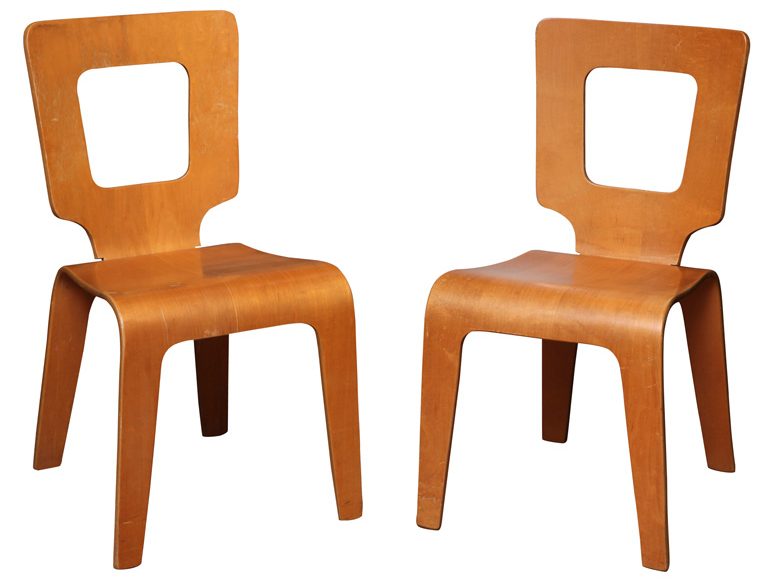
Until the mid 19th century the bentwood chair was held to the rustic constructions that were just as likely to be uncomfortable for seating as much as they were to give you a splinter. Thanks to the trials and tribulations of German-Austrian Michael Thonet (1796-1871) we now have several additions who have made their impact on the modern household, as well, some have become design icons.

Michael Thonet was an independent cabinet maker who tried for several years to concoct a way to produce chairs and other furnishings out of glued and bent wooden slats. Displaying some of these new designs at the Koblenz trade fair in 1841 he caught the attention of Vienna’s Prince Klemens Wenzel von Metternich who invited him to join the Viennese court where he had the resources to improve and produce his many designs. A succession of world trade fair medals and successes allowed him to open his own factory Gebrüder Thonet. It was here that he (and later his sons) were able not only to improve the quality of the bentwood chair but also to innovate upon its design.

Throughout all of this, perhaps the most important innovations were the use of laminated pieces of birch plywood and the improvements made in bending pieces of wood with steam. His iconic and simple Chair Number 14 had production numbers of over 50 million making Thonet one of the largest furniture manufacturers in the world. Soon, the company began producing pieces for designers and architects in both bentwood and tubular steel – always keeping up with the design aesthetic of the time. Thonet produced everything from bentwood and cane settees for the Victorian age to the chrome and black leather productions coming from the Bauhaus School. The company is still around today producing mostly contract an commercial pieces for business and public interiors.

20th Century Bentwood Chair Innovators

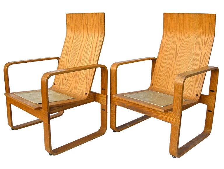
Charles and Ray Eames picked up on the work in bent plywood products where Thonet started to loose market power. Many people don’t realize that the Eames duo got their start as furniture innovators with their DCM lounges from a government commission to make bentwood leg splints and gurneys for soldiers in the war. It was this understanding of steamed and multilayered plywood veneers that lead to the evolution of this once seemingly rigid material into a strong, yet sensual and warm material with which to work. And that was just in the United States. European (specifically Scandinavian designers) were producing mind-boggling pieces that the markets snapped up as quickly as they could be manufactured.

Other famous architects and designers making masterful chairs out of bentwood: Alvar Aalto, Marcel Breuer, Joe Colombo, Bruno Matthson, Eero Saarinen and Hans Pieck (to name a few). Today’s designers know only the limits of their imaginations. They do need to keep in mind structural integrity and how the material will withstand use over time. Keep your eyes peeled for contemporary editions to the bentwood chair by such names as Grete Jalk, Ron Arad and Frank Gehry.

Adrian Pearsall Ranch of a True Craftsman

House of a Craftsman: the Adrian Pearsall Ranch

by Sarah Disney

This time last year I was e-mailing a complete stranger some suggestions for what he could do with his father’s home. I am not usually so forward. But I care deeply about the future of this particular house. It’s a one-of-a-kind modern ranch and an incredible piece of American design history. The home of an icon:Adrian Pearsall –  Adrian Mount Pearsall (1925-2011).

This story begins in the early 1950’s with a healthy dose of American grit. Like so many millennials today, Pearsall decided to leave a stagnate position in the field of his professional training (architecture) and try his own thing.

When Adrian told his wife Dorie that he wanted to begin making furniture in their basement she responded with an announcement of her own. She was waiting for the doctor to confirm her first pregnancy. After a negative result on the first pregnancy test, Adrian quit his job. Then, in a subsequent test, the rabbit kicked the bucket. Adrian’s new endeavor had to be a success.

And it was! What began as a two-man production team quickly grew into the Atomic-era manufacturing house of Craft Associates. You might recognize the space-age lines of their long, low gondola sofas, the organic look of their walnut and glass tables, or the dramatic silhouette of their high-back chairs.

An advocate for affordable, quality design, Pearsall produced hundreds of unabashedly bold pieces during his half-century-long career. But to this admirer, his artistic values were most fully expressed in the 1962 home of his own design.

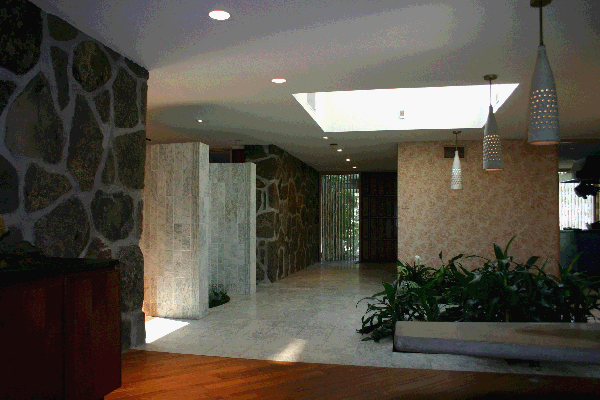
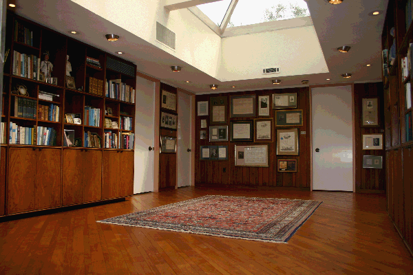
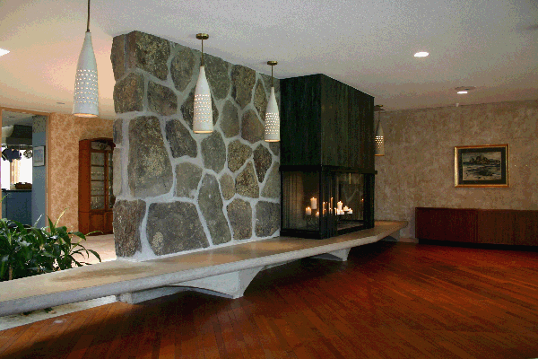
The Pearsall home celebrates the collocation of diverse materials and a connectivity to the natural world. The sprawling, 10,000 s.f. Pennsylvania ranch is an eye-pleasing patchwork of concrete, marble, stone and mahogany. Several walls are constructed of local stones, which were field-selected and hand-placed by Pearsall himself. Light-filled atriums, multiple courtyards and floor-to-ceiling glass walls promote a sense of coexistence with the landscape.

Particularly stunning are the water features in the home. Most notably a curvy indoor swimming pool (reminiscent of Pearsall’s kidney-shaped glass table designs) and a Frank Lloyd Wright-inspired pond, complete with stepping-stones, to border the dining area. The home originally included a running waterfall, which was removed for making diners feel they constantly needed to use the facilities.

This masterpiece doubled as childhood home to the Pearsall’s three children: Jim, Cindy and Jed. Jim remembers the home as a lively, creative environment where the family gathered – in leather beanbag chairs, no less – to play music and sing together. Jim’s favorite feature? The built-in soda fountain and ice cream bar, of course! Everyone preferred a different flavor and the bar accommodated all…holding up to 15 gallons of sweetness at once.

Members of the family were encouraged to entertain. The children invited friends over for homework sessions and TV time. And the adults hosted galas with up to 500 attendees and live music playing in multiple rooms.

Pearsall’s son, Jim, was also the stranger I e-mailed last year about turning his father’s home into a museum piece of “livable art” – something I’ve had a taste for since a weekend at the Louis Penfield house in Willoughby, Ohio. Jim graciously reminded me that a home of this magnitude requires much maintenance and upkeep. And that my dream of transforming it into a getaway for weary modernist design-lovers was tilting towards the grandiose.

Still, I cannot help but hope that the right buyer will want to both care for this home and share it with others.

See it for yourself! Get a visual below.

Is the Pearsall house out of your price range? Consider collecting an original piece of his furniture. There’s also a partial catalog of his work online at www.adrianpearsall.com.