Adrian Pearsall Ranch of a True Craftsman

House of a Craftsman: the Adrian Pearsall Ranch

by Sarah Disney

This time last year I was e-mailing a complete stranger some suggestions for what he could do with his father’s home. I am not usually so forward. But I care deeply about the future of this particular house. It’s a one-of-a-kind modern ranch and an incredible piece of American design history. The home of an icon:Adrian Pearsall –  Adrian Mount Pearsall (1925-2011).

This story begins in the early 1950’s with a healthy dose of American grit. Like so many millennials today, Pearsall decided to leave a stagnate position in the field of his professional training (architecture) and try his own thing.

When Adrian told his wife Dorie that he wanted to begin making furniture in their basement she responded with an announcement of her own. She was waiting for the doctor to confirm her first pregnancy. After a negative result on the first pregnancy test, Adrian quit his job. Then, in a subsequent test, the rabbit kicked the bucket. Adrian’s new endeavor had to be a success.

And it was! What began as a two-man production team quickly grew into the Atomic-era manufacturing house of Craft Associates. You might recognize the space-age lines of their long, low gondola sofas, the organic look of their walnut and glass tables, or the dramatic silhouette of their high-back chairs.

An advocate for affordable, quality design, Pearsall produced hundreds of unabashedly bold pieces during his half-century-long career. But to this admirer, his artistic values were most fully expressed in the 1962 home of his own design.

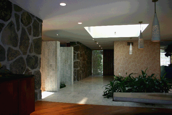
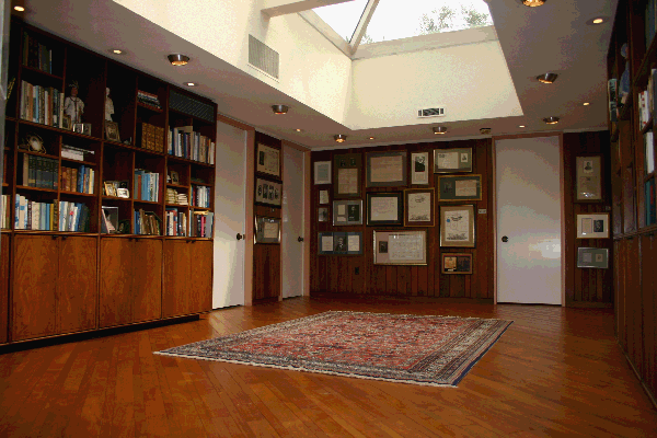
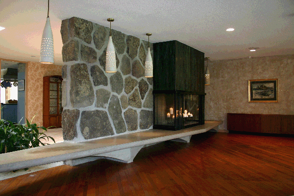
The Pearsall home celebrates the collocation of diverse materials and a connectivity to the natural world. The sprawling, 10,000 s.f. Pennsylvania ranch is an eye-pleasing patchwork of concrete, marble, stone and mahogany. Several walls are constructed of local stones, which were field-selected and hand-placed by Pearsall himself. Light-filled atriums, multiple courtyards and floor-to-ceiling glass walls promote a sense of coexistence with the landscape.

Particularly stunning are the water features in the home. Most notably a curvy indoor swimming pool (reminiscent of Pearsall’s kidney-shaped glass table designs) and a Frank Lloyd Wright-inspired pond, complete with stepping-stones, to border the dining area. The home originally included a running waterfall, which was removed for making diners feel they constantly needed to use the facilities.

This masterpiece doubled as childhood home to the Pearsall’s three children: Jim, Cindy and Jed. Jim remembers the home as a lively, creative environment where the family gathered – in leather beanbag chairs, no less – to play music and sing together. Jim’s favorite feature? The built-in soda fountain and ice cream bar, of course! Everyone preferred a different flavor and the bar accommodated all…holding up to 15 gallons of sweetness at once.

Members of the family were encouraged to entertain. The children invited friends over for homework sessions and TV time. And the adults hosted galas with up to 500 attendees and live music playing in multiple rooms.

Pearsall’s son, Jim, was also the stranger I e-mailed last year about turning his father’s home into a museum piece of “livable art” – something I’ve had a taste for since a weekend at the Louis Penfield house in Willoughby, Ohio. Jim graciously reminded me that a home of this magnitude requires much maintenance and upkeep. And that my dream of transforming it into a getaway for weary modernist design-lovers was tilting towards the grandiose.

Still, I cannot help but hope that the right buyer will want to both care for this home and share it with others.

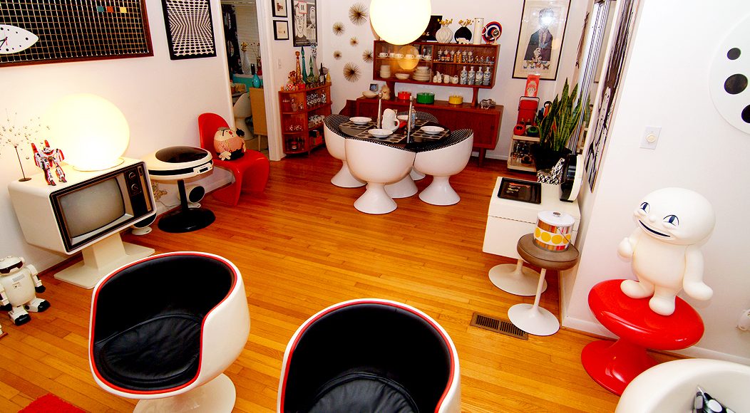
See it for yourself! Get a visual below.

Is the Pearsall house out of your price range? Consider collecting an original piece of his furniture. There’s also a partial catalog of his work online at www.adrianpearsall.com.

Harold Hollingsworth – Visual Artist

The paintings of Harold Hollingsworth are characterized by colorful graphics, rich surfaces and rhythmic playfulness. He credits popular culture as the strongest influence on his work – music, media, art and architecture. In the past, he has used familiar images such as classic croquet balls, vintage modern fonts and numbers, crossed with natural forms found in nature. Recent works are more subtle translations of pop culture, although Harold maintains that art is his way of responding and contributing to the culture of today. Presently hungry for this visual feast; flyers, old weathered ads, walls, buildings with fading paint, and remnants of art movements past are all treats up for grabs.

Harold Hollingsworth’s work is a reflection of the shapes, colors and textures that he sees in both his imagination and the material to which he is drawn aesthetically. Often is the case that he paints out of his curiosity to see what something will look like when translated from mind to the canvas.

My process and my finished works are much more dynamic than literally painting the vision I initially had in mind. I start a piece with a vision in mind, but the painting always takes on its own form and may move me in a direction I hadn’t foreseen, which is the driving force really, in the production of the work. I refer to my process as “call-and-response” … I make a move on the painting and then wait to see how it responds, as I can’t always anticipate the way that it will play on the canvas. My subsequent move is then a response to how I perceive the painting reacted. It’s like a chess game between me and the painting.

As an artist, painting is my way of affirming my participation in the culture. Other persuasions to my work come from artists such as Joan Miro, Jackson Pollock, Joseph Beuys, and local greats, Ken Kelly, Alfred Harris, Rachel Maxi, and Kimberly Trowbridge.

On a simple level, Harold Hollingsworth’s work can be described as playful, colorful abstraction – as simple and complex as that can sometimes be. Along with color, common characteristics are rich, paint-layered surfaces and graphics that have a rhythm to the patterns that get placed. This recent body of work has an element of simplicity; he does want it to be easy to enjoy. Yet, for viewers who look beyond the basic elements of pattern and color, it stands obvious that he also wants it to connect on an intellectual level. One gets the sense that Hollingsworth desires the work to stir a sense of curiosity for others, a take off point – leaving the viewer to make their own connection from elements past and present.

The strongest influence is both a mixture of popular culture – sliced with natural objects that appear in nature. The sights and sound that fill our lives – music, media, art, nature, and architecture – providing the inspiration.

– A native of Seattle, Harold has presented 17 solo shows and participated in 38 group shows. His work resonates not only with individual collectors, but corporate investors as well. Approximately 16 Nordstrom stores around the country display Harold’s work. The Target Corporation, being a logical fan of paintings of target patterns, owns a number of his pieces. Harold is a recent transplant from the United States to Berlin where he is in the process of setting up his new studio. His work and blog can be seen here.

Matthew Cummings – Contemporary Glass Artist

Matthew Cummings is an artist producing contemporary artwork about the way we see the world around us and more specifically, how we fabricate systems to understand this world. The systems that Matthew chooses to deal with range from topographical maps that visually represent a change in elevation to the abstractions produced by electron microscopes of the infinitesimally small. Since 2003, Matthew has been exhibiting his glass sculptures throughout the United States and featured in several magazines including the international publication, Glass Quarterly. He graduated from Centre College in 2005 with a Bachelor of Arts in Glass and Painting, under the tutelage of Stephen Rolfe Powell. After college, Matthew traveled throughout the country to study firsthand with expert glassblowers in order to master his craft. In 2009 he embarked upon a new aesthetic journey spurred by the On Perception Series. This recent work is realized through glass sculptures, video and glass installations, paintings, and drawings. Matthew earned the degree of Master of Fine Arts at Illinois State University in 2011. Currently, he maintains a sculpture studio in Louisville, KY where he produces sculpture and painting about the fragility of perception.

View Matthew’s art on his website!

The On Perception series are novellas for how we see and what a line or lines moving through space can mean. Since the beginning of philosophy, we have always used visual analogies to describe concepts and theories of knowledge…think Plato’s Cave and the Cartesian Theater. Since we can never actually see these things, I look to fields of study that visualize the unseen and push the boundaries of our concept of the world, such as Particle Physics, Quantum Physics, Astronomy, and Microscopy. The aesthetics of each field of study influences the visuals of my abstractions and allow the work to become metaphors for how we ‘see’ the unobservable.

-Matthew Cummings

Philco Predicta – The Original Flat Screen TV

One could argue that throughout modern history no one single product has made a larger impact on culture than the television. Perhaps the automobile, personal computer and the combustion engine are right up there – but pound for pound and hour for hour the television has become a staple for human life and defines aspects such as the people we admire, vote for, like (or dislike), the music we listen to, the products we buy. You get the point. We’re going to talk about one of the most innovative designs of the telivision – The Philco Predicta.

Although commercially available since the mid 1920’s TVs – like most new technologies – were expensive commodities.  It wasn’t until advances were made in their dependability and size that the average consumer could have one of their own. Until the 1940’s the typical method of home media entertainment outside of playing your own records on the Victrola was the radio. Current events, weather, sports, and of course the entertainment of the Lone Ranger and a host other programs for all age groups drew families into the den to tune in. At that time the radio provided you with the story line while leaving the visualizations up to the imaginations of the listener. Often was the case that a movie picture at the theater or a comic book coincided with a radio program and provided some starting point of visual reference. As with radio the main driving force behind TV remains the ability to advertise directly to consumers.

Even though the populous had seen moving pictures in the theater that experience of watching a seemingly endless barrage of programs right in the comfort of their own homes was proven to be one we all became addicted to. Science Fiction and the  display of imaginary time far off in the future opened the doors for product engineers to become front-runners in the development of the flat panel monitors and personal computers we all know and use today. It is well documented that the creators of Microsoft, IBM and Apple were inspired by these visual representation of people using personal desktop displays in everyday life.

The Philco Predicta

Taking a look at the history of flat panel monitors and when they first became available to the average consumer one cannot help but highlight the beloved and highly collectable Predicta by Philco. Until the Predicta, TVs were massive objects viewed more as a piece of furniture. Typical sets were extremely heavy units filled with circuitry and picture tubes – both notorious for malfunctioning. The Predicta was first introduced in two sizes; the 21 and the 17 inch. The 21 inch set failed often. Predicta’s reputation for failure paired with the lack of a color version and its  incredibly outlandish styling eventually lead Philco into bankruptcy in the 1960’s.

The idea to have this floating screen not surrounded by a thick bulky box was revolutionary. The Predicta’s screen itself worked like most common TVs of its age with the main picture tube translating and deciphering high frequency radio signals into moving imagery on the screen – But there was a major difference. Instead of building a boxy set around this general function the box at the base did all of the work, held all of the circuitry and controlled the picture and sound quality.  The screen of the Predicta is attached by a tether or umbilical cord. The monitors could actually be lifted off the stand while still functioning. This umbilical cord held the mass of wires – mostly attached to the main picture tube at the back of the screen – and connected it to all of the controls like the vertical and horizontal hold, the brightness and contrast. It was a marvel of engineering for its day.

Telstar now produces new versions of the Predicta after purchasing the rights to the Predicta brand. Take a look at their fun gallery of models. If you love these old sets we recommend contacting Telstar or saving an old one off eBay and taking a shot at restoration. If anything, just for looks!

Telstar was kind enough to send us these images of a few of their fully restored and functional beauties!

Russel Wright - American Modern

Modern American Ceramics

Editor’s Note: Modern American Ceramics and modernism are two of our favorite subjects. Here are a few of our choice lines from the mid 20th century. We will revisit this subject often.

The term American Modern is a distinct American design aesthetic formed in the period between 1925 and World War II. American Modern was created by a pioneering group of designers, architects and artists, among them were Norman Bel Geddes, Donald Deskey, Henry Dreyfuss, Paul Frankl, William Lescaze, Raymond Loewy, Gilbert Rohde, Eliel Saarinen, Walter Dorwin Teague, Kem Weber and Russel. Their impact on the daily lives of ordinary Americans is exemplified through a wide array of objects including furniture, glassware, ceramics, textiles, metalwork, household appliances, automobiles, airplanes and graphic arts. American Modern is distinguished by the absence of traditional ornament, the use of new technologies and materials, and the adoption of mass-production techniques to create affordable objects for the expanding population.

American Modern dinnerware by Russel Wright 1939 – 1959

American Modern Dinnerware. Colorful and curvaceous dinnerware designed by Russel Wright originally manufactured by Steubenville Pottery in Steubenville, Ohio and currently manufactured by Bauer Pottery Company of Los Angeles. Its unique and immediately recognizable colors of coral, chartreuse, granite grey and seafoam, as well as its distinctive curvilinear decorative shapes, went on to make American Modern dinnerware the most popular and identifiable china pattern/china colors ever sold, with over 250 million pieces sold between 1939 – 1959 alone.

Russel Wright also produced several other lines of pottery for the growing needs of the American middle-class including Iroquois Casual (1946), and Residential Melamine (1953). For all of these series and sets one can easily grasp the idealistic notions Wright was separating himself from and at the same time gain an understanding for those notions of Modernism he was moving towards.

Hall Pottery for Westinghouse and Hotpoint – Universal and Oxfordware Pottery

Hall, Universal and Oxfordware Pottery refridgerator dishes

Hall, Universal and Oxfordware Pottery

Around the same time frame one of the nation’s largest ceramics manufacturers expanded its reach by giving away its wares. Refrigerators — must-haves for homes in the modern age — were being sold almost faster than they could be produced. Companies like General Electric, Hotpoint and Westinghouse kept up with America’s demand while retail outlets made deals with companies like Pyrex, Universal, Hall Pottery and others to make their sales more enticing to consumers.

Hall for Westinghouse Label

Hall for Westinghouse Label

Enter the mass produced refrigerator dishes. With the convenience of preserved food and beverages in the home came the need to stylishly store them. Hall Pottery went one step further by making different lines and sets of refrigerator dishware for different retailers. The more curvaceous and slightly more stately designs were fit for customers buying their appliances at Montgomery Ward & Co. The more utilitarian and boxier of the designs were for those buying their iceboxes through Hotpoint and Westinghouse. Of course, one could purchase pieces separately but the larger retailers would give make deals with ceramics manufacturers to offer them free with their products.

Gonked Glooked Slurped – Two Mega-Collectors

Valery and Tony: Two young creatives  presently residing  in Georgia, USA – invite the world along as they collect, curate and explore the many items in which they choose to surround their lives. The newlywed duo continues to build their collections at their mid-century ranch simultaneously tackling the chore of renovation. Together they operate the blog Gonked Glooked Slurped where they share their passions with a wider audience.

Clearly a design conscious couple, there is no element of snobbery and certainly no reductionist  sensibility impeding the never ending assortment. Furniture, records, electronics, ephemera, visual art in all forms and formats  live here. A body of objects seemingly recognizable from our past – yet probably most of us neglected to hold onto – live, play, perhaps go to war when no one is watching (there is a Viking army after all).

Little Miss No Name belongs here (a very sad looking doll with a big plastic tear permanently about to fall from her right eye) as do several high end original furniture pieces. Taking just a glimpse of the couple’s collection one could feel overwhelmed and misunderstand the intimacy going on in just about every square foot of every room. A play of color, light, form,  personality and frivolity culminate into a storyline here. It’s anyone’s guess as to that story’s plot – obviously an intense journey through Indie and Pop culture continues to be written – the sentence about form following function was completely erased and continues down its path of redefinition.