Neo-Plasticism, De Stijl and its contemporary influences.

Piet Mondrian
Twentieth century art is seen by many as a series of movements evolving from either an opposition to or an extension of concepts of previous movements. While some movements quickly pass the newness stage in their lifespans, their philosophies continue to live on, even though greater attention may be given to even newer movements. In the case of De Stijl and Neo-Plasticism, the theoretical end of this “life span” came with the death of one of its founders, Theo Van Doesburg. Here we explore the fascinating art movement and its influences on contemporary culture.
De Stijl, Dutch for “The Style”, also known as Neo-plasticism, was a Dutch artistic movement founded in 1917 and staked its place in the history of art and design at nearly the same time as its close counterparts Suprematism and Constructivism. The group’s principal members were the painters Theo Van Doesburg and Piet Mondrian with a number of others artists like Bart van der Leck and the architects Gerrit Rietveld and J.J.P. Oud contributing shortly after the movement’s birth. The artistic philosophy that formed a basis for the group’s work is known as Neo-plasticism — the new plastic art.
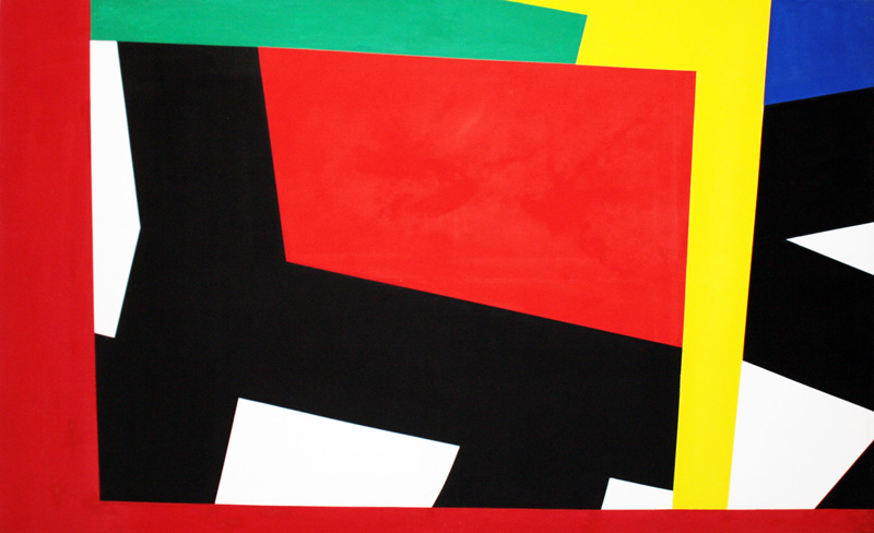
Proponents of De Stijl sought to express a new utopian ideal of spiritual harmony and order. They advocated pure abstraction and universality by a reduction to the essentials of form and colour; they simplified visual compositions to the vertical and horizontal directions, and used only primary colors along with black and white. De Stijl was built on the fundamental principle of the geometry of the straight line, the square, and the rectangle, combined with a strong asymmetricality; the predominant use of pure primary colors with black and white; and the relationship between positive and negative elements in an arrangement of non-objective forms and disections.
 These strict guidelines lead to works heavily weighted on their compositional structure – works whose subjects were produced as “pure” and non-representational abstraction and are not to be mistaken with the later Abstract Expressionist movement. These guidelines were very limiting yet have lead to an artistic language that has stood strong and influenced many throughout the ages as in fashion and typography design, product design as reinterpreted through the Bauhaus school, architecture and visual art later in the 20th century. Artists working in the template of Neo-Plasticism and De Stijl had just begun to experience success in the early 1940s when the emergence of Abstract Expressionism swept aside the public recognition of those achievements. It was not until Minimalism ushered in a renewed enthusiasm for geometric abstraction in the 1960s that their works began to receive serious attention.
Architecture
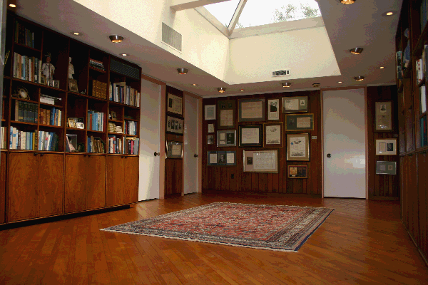
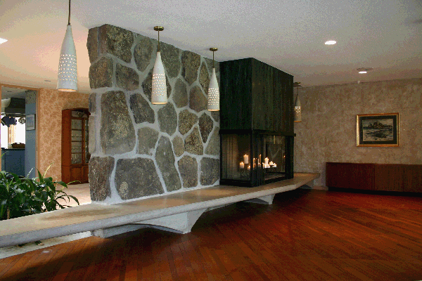
The Schroder House designed by Gerrit Rietveld in the Netherlands is one of the very few examples of Neo-plastic architecture. Although there are many examples of murals, ceramic and interior installations designed to reflect the principles of Neo-plasticism there are very few architectural structures. The Schroder House is the only shining example remain to this day.

Rietveld’s Shroder House
Neo-Plasticism in America
Burgoyne Diller

Burgoyne Diller
De Stijl and Neo-Plasticism were late arrivals to the American art scene in terms of its development as an art movement. Only through a few select gallery and museum exhibitions were American artists introduced to the works of European artists including that of Piet Mondrian and Theo Van Doesburg. The few drawn to the new plastic way of seeing had already established roots in Impressionist and Post-Impressionist painting.
Burgoyne Diller was the first noteworthy American painter to embrace the tenets of Neo-Plasticism. Diller was already on his way to making an important contribution to the development of non-objective art in the United States and his works were the footers in the foundation that lead to the development of the Minimalism movement of the mid 20th century.
Born in New York in 1906, yet raised in Michigan, he began painting and drawing as a teenager. Periodic trips to the Art Institute of Chicago proved monumental in his development – he found himself drawn to the Impressionist paintings and their use of color and composition to create volume on a two dimensional surface. Moving to New York City in 1929 and enrolling in the Arts Students League exposed him to progressive working artist’s work and the growing popularity of Cubism, German Expressionism and other Avant-garde styles. His first solo exhibition was in 1933 at the Contemporary Arts Gallery in Manhattan where he experienced a frustration with the fact that he could not sell any of his paintings. 1935 brought forth the opportunity to act as director for the Mural Division of the WPA Federal Arts Project where Diller was not only at liberty to create and execute public art projects but to commission other abstract artists to do the same. Diller was also a member of American Abstract Artist which promoted alternating sects of non-representational art through exhibitions and collaborations with museums and galleries. He continued to paint through the 40s and 50s defining his own personal graphic voice while serving as the acting director of the War Service Art Section and in the design department at Brooklyn College.
As is true with many artists, Diller’s work did not receive great recognition until after his death in 1965. His work is now considered a fundamental addition to the development of Abstract art and has been the subject of a number of important museum exhibitions throughout Europe and the United States. For the contemporary collector; Diller works are hard to get one’s hands on with works on paper (usually ink and/or gouache) ranging from 5000USD – 40000USD. Original paintings and wall constructions at 40000USD and up. Diller created no limited edition prints, limiting the entry level purchase to a work on paper – usually only available at auction Houses and fine art galleries.
Ilya Bolotowsky

Ilya Bolotowsky
Highly influenced by Piet Mondrian, Ilya Bolotowsky constantly searched for order through his visual expressions. However, unlike the earlier adapters of the tenets of Neo-plasticism Bolotowsky’s visual language was fueled by the now popular Suprematist, Cubist, Constructivist, and Abstract Expressionist art movements. Born in St. Petersburg, Russia, he immigrated to America in 1932 and attended the National Academy of Design. He quickly associated himself with “The Ten Whitney Dissenters”, a group of artists who, unhappy with academy and museum structures soon began to mount their own exhibitions. It was here that he credits his magnetic draw to Mondrian’s work.
Bolotowsky was also a founding member of American Abstract Artist where he met other artists such as Burgoyne Diller. It was Diller who gave him the commission for the mural for the Williamsburg Housing Project which was one of the first purely abstract murals created under the Federal Art Project. Bolotowsky’s career was temporarily put into suspension while he served his country, stationed in Alaska. From 1946-48 he was a teacher at Black Mountain College where he was not only influenced by his fellow teachers, but also by his students.
One may suspect by looking closely at Bolotowsky’s late work that clear, precise control of his images was of utmost importance. He did however emphasized the role of intuition over formula in determining his compositions and in many of his interviews states that the pieces are just as much an abstract composition as they are what the viewer saw in them. After all, one man’s Neo-plastic composition in yellow and blue was another man’s reduced aerial depiction of a farmer’s pasture dissected by roads and property lines!
Later in his career (the 1960’s – 1981), he began combining his two-dimensional works with three-dimensional forms, usually vertical and straight-sided columns.
Ilya Bolotowsky’s works are in multiple important public and private collections worldwide. Thankfully, since he was steadily producing work through the mid 20th century, he created many varied serigraphs and prints which are relatively easy to find from galleries, resellers, auction houses and online.
Pierre Clerk

Pierre Clerk
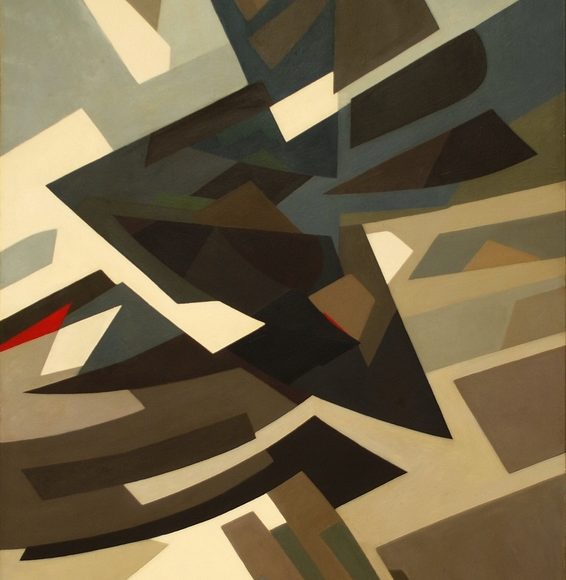
Pierre Clerk was born in Atlanta, Georgia in 1928. He studied fine arts at McGill University, Loyola College and at the Montreal Museum of Fine Arts in Montreal, Canada. He traveled to Europe to seek further instruction at the Academy Julien in Paris, France and the Accademia di Belle Arti in Florence Italy.
Pierre Clerk first gained recognition in the United States and Canada with his large sculpture and painting installations – the most recognizable of these is still installed outside the Toledo Art Museum in Toledo, Ohio. Clerk was often quoted as having been strongly influenced by De Stijl. Well into the 21st century (in his 80’s) he continues to produce an astounding array of large-scale abstract geometric paintings from his studio in France. One can see an obvious tie to the fundamental rules of Neo-plasticism and De Stijl in Clerk’s work – however they beg to call these rules into question. Subsequently, he not only calls them into question, but disregards these rules just enough to define his work as a unique addition. Absent from his work are compositions adhering to strict primary color usage. Although black lines and shapes are often present in his work, rarely are they horizontal or vertical. Big, bold and commanding – his work is a perfect combination of art movements such as De Stijl and Minimalism as they presented themselves and evolved in his lifetime.
The Clerk image shown is from his Africa Suite. As with Bolotowsky, Clerk often produces work that is not just pure abstraction. Although abstract in nature the work often represents a theme, a place, an idea that is only known to Clerk and only slightly alluded to in a brief title.
Lucky for collectors, Pierre Clerk is still producing work (and large powerful work at that) to this day. For the beginning collector there are an array of serigraphs of excellent quality available at auction houses, galleries and online. Be sure to check out these recent paintings, on exhibit through his gallery representation at Cortex Athletico in France.
Bryce Hudson

Bryce Hudson
Bryce Hudson is among a small set of contemporary artists presently working to decipher the boundaries of geometric abstraction as they relate to past art movements and the present day. Hudson, who is biracial, began his career with the production of symbolic works in which he would combine this geometric abstraction with an underlining tie to race and class stereotypes in American society. His black and white color frequently represented Black and Caucasian races, yellow and orange represented Asian and Latin races.
Hudson’s work has always been weighted on its compositional structure – he also produces multimedia prints and altered digital representations from the graphic advertisements and images of the 20th century. In his paintings the reductionist influences of De Stijl and the later Minimalism movement of the mid 20th century cannot go unnoticed.
Presently, Hudson has withdrawn from his original approach to these either tongue-in-cheek representations or direct reinterpretations from American census surveys and allowed his work to follow a more abstract nature.
Are they purely abstract geometric compositional works or are they interiors reduced to their most basic elements of shape, light and color? Whichever the case they, too, are part of the new plastic reality that his contemporaries set out to explore and define a century ago.
Bryce Hudson’s work can be seen on his site: Contemporary Artist Bryce Hudson
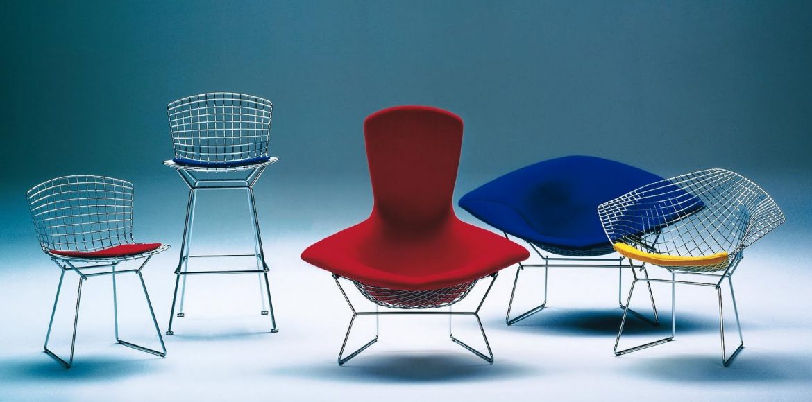
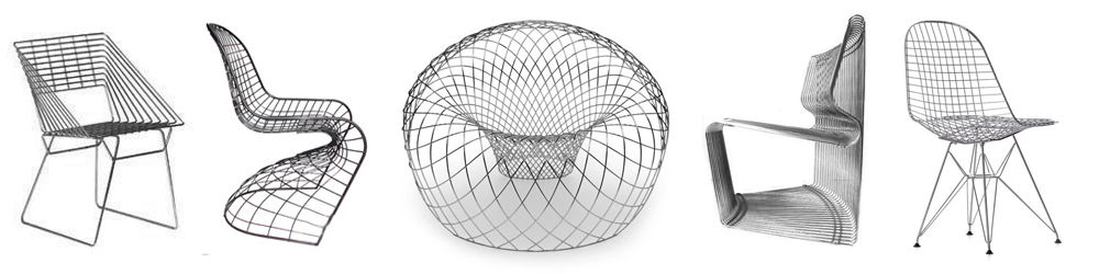
 The birth of the wire chair’s popularity can easily be traced back to Charles and Ray Eames’s wire side chair released in 1951. This iconic object for everyday use fit right along with their fundamental principle for its use of new material. Wire rods were by no means new material in that era although their use as a structure for seating certainly was. As is the case when it comes to iconic forerunners, this simple side chair was not the only one of its kind. Beyond this side chair by the dynamic Eames duo, Harry Bertoia’s 420 side chair is just about the only iconic wire chair recognizable by name to the modern enthusiast.
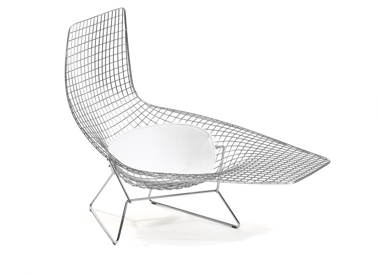 The Pantanova and Planter chairs – as with the more complex designs – are usually out of reach for the beginning consumer. A Pantanova Chaise can run between 4000-7500USD with the wormhole-like Reverb chair (created in a very limited production) costing 25,000USD. Our best bets are to find the chair (or chairs) you love and research! Then, stalk! Original Bertoia and Eames wire side chairs can be found at your local mid-century dealer in the 175-400USD range. As always, check the web and eBay. If you miss out on a bargain, never fear, there will always be another chance as millions were produced for the global market. On the higher end if you find what suits you best, never be afraid to ask a dealer if they can come down on the price. Even the most high end of dealers will consider a slight discount if they know they will receive a certain sale. Whatever your choice you’ll find that a wire chair will bring a unique linear openness to your space – making these useful structural objects a great addition.